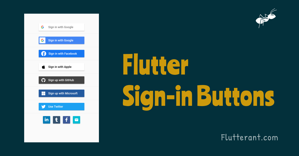
We all know that the latest trend is to ask people to sign in or register using their social media accounts for onboarding. As a result, users may easily create / register accounts and do not need to remember passwords. We will learn how to create social media accounts with flutter sign-in buttons in this tutorial.
About flutter_signin_button package
A Flutter plugin that generates sign-in buttons for various social media accounts in both Android and iOS. With this package, we can construct social media buttons for Email, Google, Facebook, GitHub, Apple, LinkedIn, Pinterest, Tumblr, Twitter, Reddit, Quora, Yahoo, Hotmail, Xbox, and Microsoft.
Adding dependency
We need to add the flutter_signin_button package to pubspec.yaml and run the pub get command to get it into our flutter project.
dependencies:
  ...
  flutter_signin_button: ^2.0.0
Import Package
We can use the classes and functions of the package by importing it into our flutter project after it has been installed.
import 'package:flutter_signin_button/flutter_signin_button.dart';Built in Buttons
The class ‘SignInButton‘ already has some commonly used buttons.
If more buttons are required, we can always utilize ‘SignInButtonBuilder‘ to create the sign-in button.
  SignInButton(
    this.button, {
    required this.onPressed,
    this.mini = false,
    this.padding = const EdgeInsets.all(0),
    this.shape,
    this.text,
    this.elevation = 2.0,
  })
The above snippet is the constructor of SignInButton. Now we’ll look at the SignInButton’s parameters one by one.
Buttons button: The enum class ‘Buttons’ should be used for buttons. This parameter allows you to choose the type of social media account you want to use. For example, if the button type is set to Buttons.Facebook, the Facebook button will be created.
 SignInButton(
            Buttons.Facebook,
            mini: false,
            onPressed: () {},
          )
Output:

Function onPressed: The onPressed function should be specified as a mandatory field. Inside this function, we can write the logic for sign and register. When the user hits the button, it will be triggered.
 SignInButton(
            Buttons.Facebook,
            mini: false,
            onPressed: () {
              Navigator.of(context).push(MaterialPageRoute(builder: (context) => HomePage()));
            },
          )
bool mini: The mini is a boolean field that indicates whether a square mini button should be used. The small button will be enabled if the value is set to true. False is the default value.
SignInButton(
            Buttons.Facebook,
            mini: true,
          )
Output:

ShapeBorder? shape: The shape is used to specify the widget’s custom shape.
SignInButton(
            Buttons.Facebook,
            shape: RoundedRectangleBorder(
                borderRadius: BorderRadius.circular(16
                )),
            onPressed: () {
            },
          )
Output:

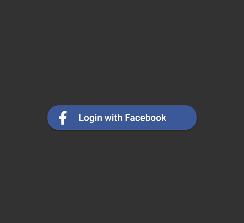
String? text: This property allows us to give the custom text to the Button. Instead of using the default string.
SignInButton(
            Buttons.Facebook,
            text: "Login with Facebook",
            shape: RoundedRectangleBorder(
                borderRadius: BorderRadius.circular(16
                )),
            onPressed: () {
            },
)Output:
EdgeInsets padding: This property enables us to provide the button padding.
  SignInButton(
            Buttons.Facebook,
            padding: const EdgeInsets.all(8.0),
            onPressed: () {
            },
          )
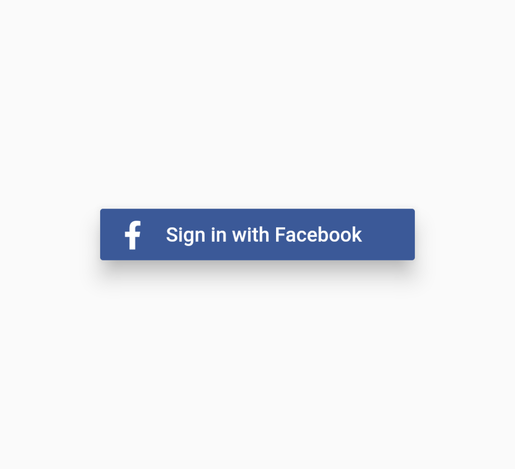
double elevation: This property allows us to give the elevation to the button
  SignInButton(
            Buttons.Facebook,
            elevation: 12.0,
            onPressed: () {
            },
          )
Output:
Self-build buttons
Without using the built-in buttons, we can create custom buttons by providing the essential parameters. The SignInButtonBuilder(..) class is used to create custom buttons.
SignInButtonBuilder({
    Key? key,
    required this.backgroundColor,
    required this.onPressed,
    required this.text,
    this.icon,
    this.image,
    this.fontSize = 14.0,
    this.textColor = Colors.white,
    this.iconColor = Colors.white,
    this.splashColor = Colors.white30,
    this.highlightColor = Colors.white30,
    this.padding,
    this.innerPadding,
    this.mini = false,
    this.elevation = 2.0,
    this.shape,
    this.height,
    this.width,
  });
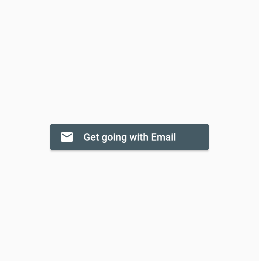
The above snippet is the constructor of the SignInButtonBuilder(..) class. The SignInButtonBuilder(…) is used to create an email button in the examples below.
SignInButtonBuilder(
            text: 'Get going with Email',
            icon: Icons.email,
            onPressed: () {
              _showButtonPressDialog(context, 'Email');
            },
            backgroundColor: Colors.blueGrey[700]!,
            width: 220.0,
          ),
Output:
Like that, We can customize the button bypassing the required attributes to SignInButtonBuilder().
Now that we have a better understanding of the flutter sign-in button, let us combine all of the buttons into a single page to gain better understanding.
Flutter Sign-in buttons Example
Create a new flutter project and remove the boilerplate code and add the following code and run the application.
// Flutter Sign-in buttons - FlutterAnt

import 'package:flutter/material.dart';
import 'package:flutter_signin_button/flutter_signin_button.dart';

void main() => runApp(MyApp());

class MyApp extends StatelessWidget {
// Flutter Sign-in buttons - FlutterAnt

  @override
  Widget build(BuildContext context) {
    return MaterialApp(
      title: 'Flutter Demo',
      theme: ThemeData.light(),
      home: Scaffold(
        body: SignInPage(),
      ),
      debugShowCheckedModeBanner: false,
    );
  }
}

class SignInPage extends StatelessWidget {
// Flutter Sign-in buttons - FlutterAnt
  @override
  Widget build(BuildContext context) {
    return Center(
      child: Column(
        mainAxisAlignment: MainAxisAlignment.center,
        children: <Widget>[
          SignInButton(
            Buttons.Google,
            onPressed: () {

            },
          ),
          Divider(),
          SignInButton(
            Buttons.GoogleDark,
            onPressed: () {
            },
          ),
          Divider(),
          SignInButton(
            Buttons.FacebookNew,
            onPressed: () {
            },
          ),
          Divider(),
          SignInButton(
            Buttons.Apple,
            onPressed: () {
            },
          ),
          Divider(),
          SignInButton(
            Buttons.GitHub,
            text: "Sign up with GitHub",
            onPressed: () {
            },
           // Flutter Sign-in buttons - FlutterAnt

          ),
          Divider(),
          SignInButton(
            Buttons.Microsoft,
            text: "Sign up with Microsoft ",
            onPressed: () {
            },
          ),
          Divider(),
          SignInButton(
            Buttons.Twitter,
            text: "Use Twitter",
            onPressed: () {
            },
          ),
          Divider(),
          Row(
            mainAxisAlignment: MainAxisAlignment.center,
            children: <Widget>[
              SignInButton(
                Buttons.LinkedIn,
                mini: true,
                onPressed: () {
                },
              ),
              SignInButton(
                Buttons.Tumblr,
                mini: true,
                onPressed: () {
                },
              ),
              SignInButton(
                Buttons.Facebook,
                mini: true,
                onPressed: () {
                },
              ),
              SignInButtonBuilder(
                icon: Icons.email,
                text: "Ignored for mini button",
                mini: true,
                onPressed: () {
                },
                backgroundColor: Colors.cyan,
              ),
            ],
          ),
        ],
      ),
    );
  }
}

// Flutter Sign-in buttons - FlutterAnt
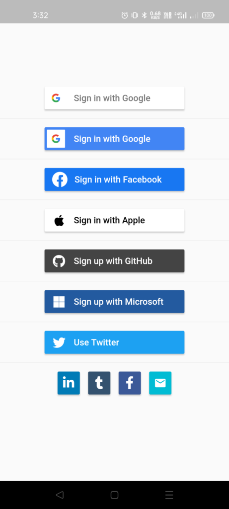
If the application is successfully run, the output will be as shown in the image below.
Click here for more details on flutter_signin_button
Thanks for reading … 🙂
