In this article, we are going to learn about the flutter AppBar widget and its all properties. Almost Every mobile application uses an AppBar. Since everything in flutter is basically a widget, the app bar is also a widget that is placed in a scaffold widget. That means the app bar is one of the child widget of the scaffold, which places the AppBar as a fixed-height widget at the top of the screen.
The AppBar widget is based on Material Design, so we need to import the Material Components package for the flutter
import 'package: flutter/material.dart'The following snippet is the constructor of the AppBar
AppBar({
 Key key,
 this.leading,
 this.automaticallyImplyLeading = true,
 this.title,
 this.actions,
 this.flexibleSpace,
 this.bottom,
 this.elevation,
 this.shadowColor,
 this.shape,
 this.backgroundColor,
 this.brightness,
 this.iconTheme,
 this.actionsIconTheme,
 this.textTheme,
 this.primary = true,
 this.centerTitle,
 this.excludeHeaderSemantics = false,
 this.titleSpacing = NavigationToolbar.kMiddleSpacing,
 this.toolbarOpacity = 1.0,
 this.bottomOpacity = 1.0,
 this.toolbarHeight,
 this.leadingWidth,
})
//Flutter AppBar widget - Flutterant
The AppBar has no needed properties in the constructor, as we can see. As a result, we can utilise AppBar without specifying any parameters.
 @override
  Widget build(BuildContext context) {
    return Scaffold(
      appBar: AppBar(),
      body: Center(child: Text("www.flutterant.com")),
    );
  }
AppBar widget properties:
1. Key key: A Widget key is an identifier of the widget.
2. Widget leading: The leading property holds the small widget which is like an Icon or an IconButton and displays before the title.
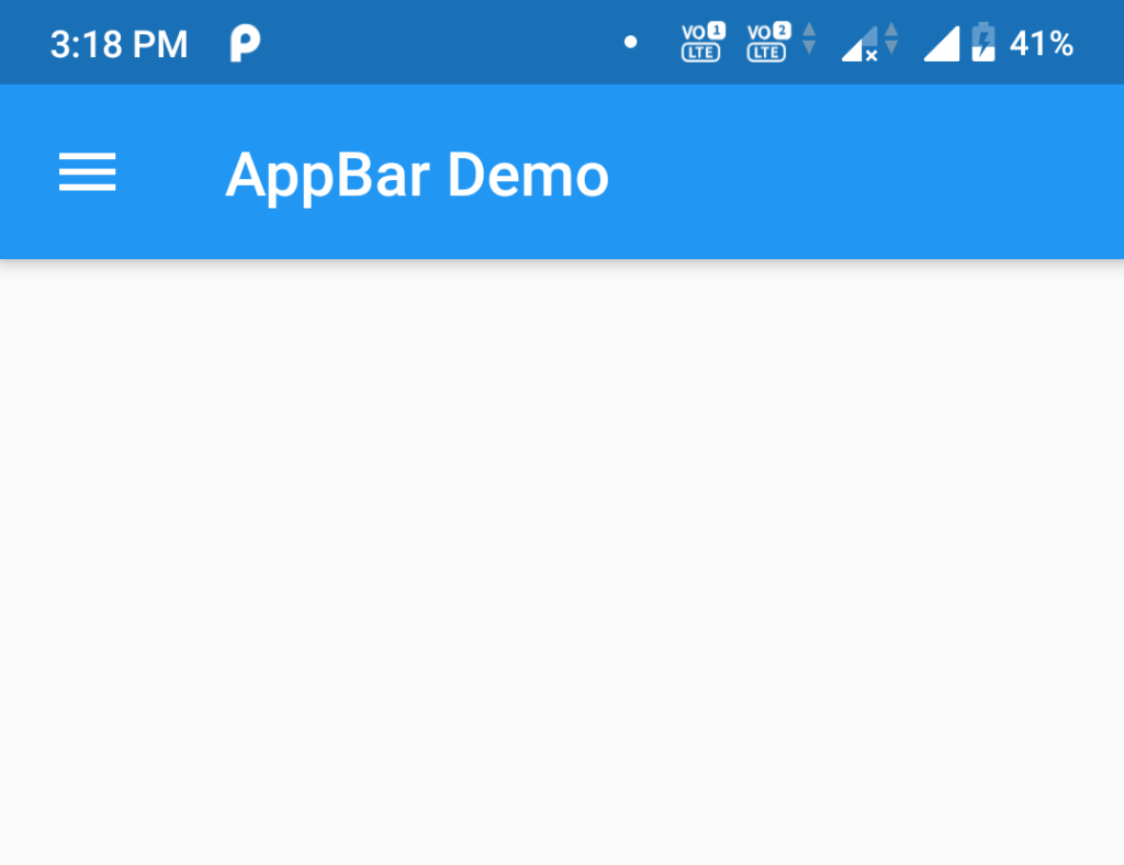
If this property is null and automaticallyImplyLeading is set to true the app bar will display the appropriate widget.
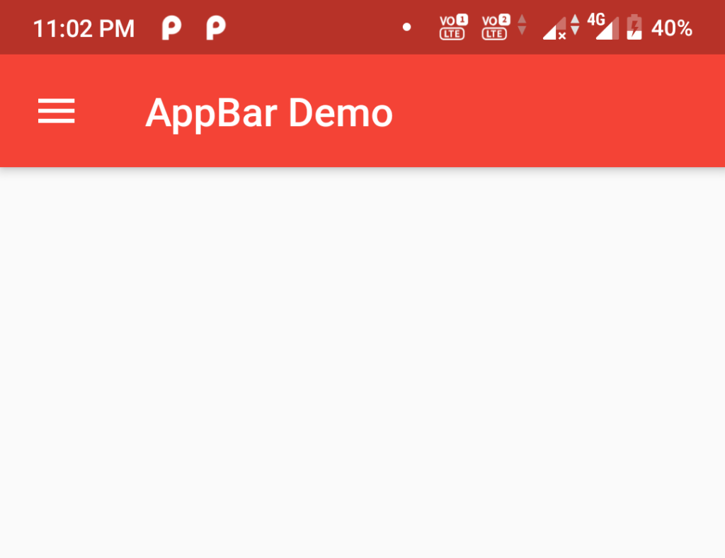
For example, AppBar is in a Scaffold with a Drawer, then a menu button will be inserted to open the drawer
@override
Widget build(BuildContext context) {
return Scaffold(
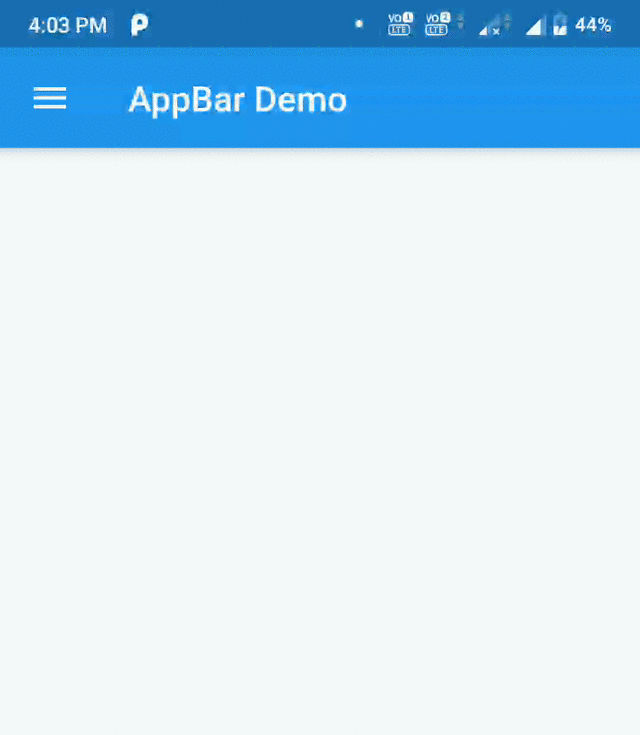
appBar: AppBar(title: Text("AppBar Demo")),
//Here we can see the leading property is null in AppBar
drawer: Drawer(...),
);
}
Or, if there is no Drawer and the parent navigator can go back, then a Back Button is inserted to call Navigator.maybePop.
//First Screen
class MyAppBar extends StatelessWidget {
  @override
  Widget build(BuildContext context) {
    return Scaffold(
      appBar: AppBar(title: Text("AppBar Demo")),
      //Here we can see the leading property is null in AppBar
      body: Center(
        child: RaisedButton(
          onPressed: () {
            Navigator.push(context,
                MaterialPageRoute(builder: (context) => SecondScreen()));},
          child: Text("Second Screen"),
        ),
      ),
    );
  }
}
//Flutter AppBar widget - Flutterant
//Second Screen
class SecondScreen extends StatelessWidget {
  @override
  Widget build(BuildContext context) {
    return Scaffold(
      appBar: AppBar(
        title: Text("Second Screen"),
      ),
    //Here we can see the leading property is null in AppBar
    );
  }
}
//Flutter AppBar widget - Flutterant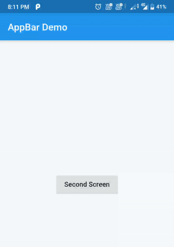
- Changing the Default Drawer icon
The following snippet shows to change the default Drawer Icon
Scaffold(
      appBar: AppBar(
          title: Text("AppBar Demo"),
          leading: Builder(builder: (BuildContext context) {
            return IconButton(
                icon: Image.asset("images/custom_menu.png"),
                onPressed: () {
                  Scaffold.of(context).openDrawer();
                });
          })),
      drawer: Drawer(...),
    );
//Flutter AppBar widget - Flutterant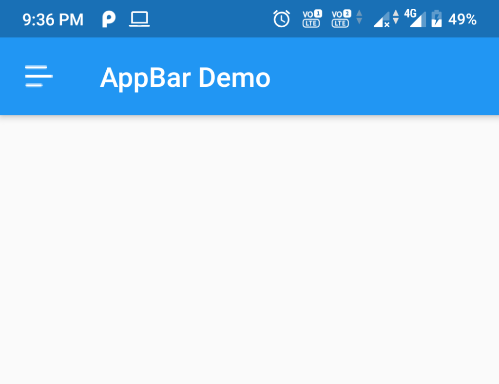
3. bool automaticallyImplyLeading: If this property is True and leading is null, it will give the appropriate widget. If it is False and leading is null, leading space is given to the title. If leading is not null, this parameter has no effect
4. Widget title: This property uses a Text widget to display the description of the current contents of the app
5. List<Widget> actions: This property allows to display the list of widgets in a row after the title, These widgets are basically IconButtons for common operations, and for less common operations we should use PopupMenuButton.
AppBar(
        actions:<widget>[
          IconButton(
              icon: Icon(Icons.search), onPressed: () => {print("Search action button clicked ")}),
          IconButton(
              icon: Icon(Icons.duo), onPressed: () => {print("Duo action")})
        ],
        title: Text("AppBar Demo"),
      ),</widget>
//Flutter AppBar widget - Flutterant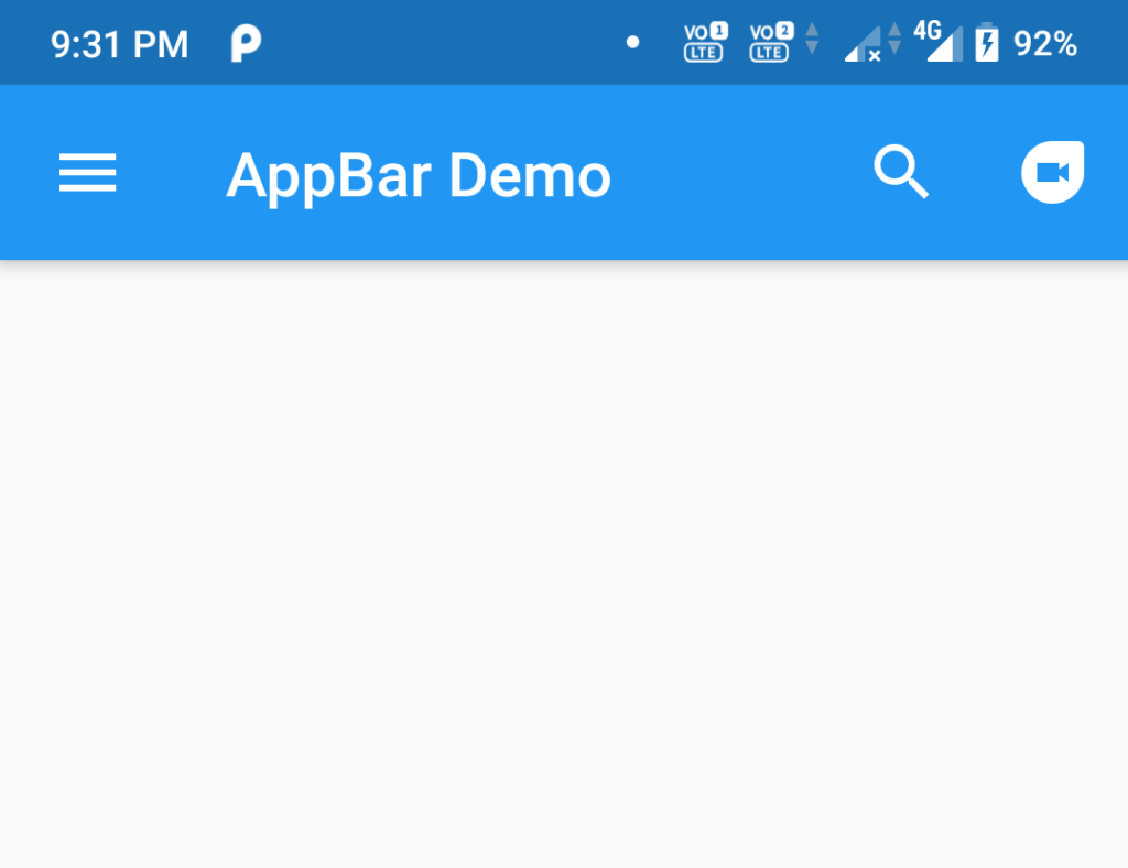
6. Widget flexibleSpace: This widget is layered behind the toolbar and tab bar, with a height equal to the app bar’s height. When the size of the AppBar changes, the flexible space changes as well. A SliverAppBar in a CustomScrollView changes the height of the AppBar as the app scrolls. A separate article will be written about SilverAppBar.
7. PreferredSizeWidget bottom: This widget appears at the bottom of the app bar. The bottom property is usually used for a TabBar.
8. double elevation: This property controls the size of the shadow below the appbar. AppBarTheme.elevation will be used when this property is null. If that is also null the default value will be considered i.e. 4. The value should be non-negative.
 AppBar(
   title: Text("AppBar Demo"),
   elevation: 50.0
)
9. Color shadowColor: This property gives the shadow color below the app bar. AppBarTheme.shadowColor will be used when this property is null. If that is also null the default value is fully opaque black will be used.
AppBar(
        title: Text("AppBar Demo"),
        elevation: 20.0,
        shadowColor: Colors.red,
      )
10. ShapeBorder shape: This property is used to give the shape to app bar
AppBar(
        title: Text("AppBar Demo"),
        elevation: 10.0,
        shape: RoundedRectangleBorder(
        borderRadius: BorderRadius.vertical(
        bottom: Radius.circular(15),
          ),
        ),
        actions: <Widget>[
          IconButton(icon: Icon(Icons.search), onPressed: () => {})
        ],
      )
//Flutter AppBar widget - Flutterant
11. Color backgroundColor: This property is used to change the background colors of the app bar. AppBarTheme.color is used when this property is null. If that is also null ThemeData.primaryColor will be used.
AppBar(
        title: Text("AppBar Demo"),
        backgroundColor: Colors.red,
      )
12. Brightness brightness: To give brightness to the appbar. AppBarTheme.brightness will be used when this property is null. If that is also null, then ThemeData.primaryColorBrightness is used.


13. IconThemeData iconTheme: The Theme (colour, opacity, and size) of app bar icons can be changed with this parameter. When this property is null, AppBarTheme.iconTheme is used; if that is also null, ThemeData.primaryIconTheme is used.
AppBar(
        title: Text("AppBar Demo"),
        iconTheme: IconThemeData(
          color: Colors.red,
        ),
        actions: <Widget>[
          IconButton(icon: Icon(Icons.search), onPressed: () => {})
        ],
      ),
//Flutter AppBar widget - Flutterant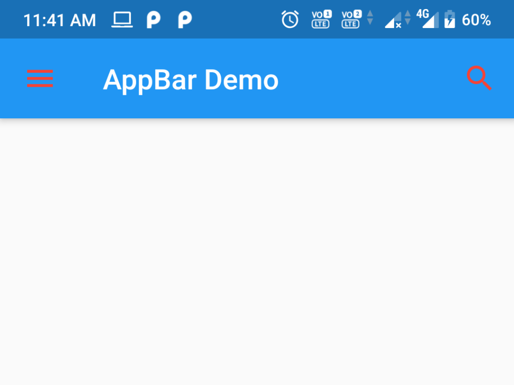
14. IconThemeData actionsIconTheme: This property allows to change the Theme (color, opacity, and size) of the app bar’s action icons. This should be only used when app bar AppBarTheme.actions When this property is null, iconTheme is used; if that is also null, iconTheme is used.
AppBar(
        title: Text("AppBar Demo"),
        actionsIconTheme: IconThemeData(
          color: Colors.red,
        ),
        actions: <Widget>[
          IconButton(icon: Icon(Icons.search), onPressed: () => {})
        ],
      ),
//AppBar widget -flutterant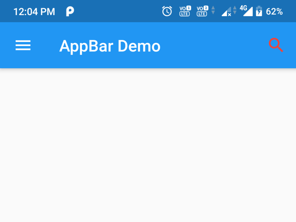
15. TextTheme textTheme: This property is allowed to use typographic styles for text in the app bar AppBarTheme.textTheme will be used when this property is null, If that is also null, then ThemeData.primaryTextTheme will be used.
16. bool primary: If this property is True, appbar elements and the bottom widget will be padded on top by the system status bar.


17. bool centerTitle: If this property is True, the title will be displayed on the center of the appbar.
18. bool excludeHeaderSemantics: If this property is True, the title will be wrapped with header Semantics. The default value is false.
19. double titleSpacing: This property is allowed to give space to title content on the horizontal axis, even if there is no leading or actions on the appbar. The default value is NavigationToolbar.kMiddleSpacing.
20. double toolbarOpacity: This property is allowed to give the opacity value to the toolbar. A value of 1.0 is fully opaque which is the default value and 0.0 is fully transparent. This property is used for animating the toolbar opacity when the app scrolled in SilverAppBar.
21. double bottomOpacity: This property is allowed to give the opacity value to the bottom part of the app bar. A value of 1.0 is fully opaque which is the default value and 0.0 is fully transparent. This property is used for animating the toolbar opacity when the app scrolled in SilverAppBar
22. double toolbarHeight: This property is allowed to give the toolbar height of an app bar. The default value is kToolbarHeight.
23. double leadingWidth: This property is allowed to give the width to the leading widget. The default width is 56.0
Here you can find the source code for how to develop the AppBar widget of Youtube, Whatsapp, and Messenger.


For official document of AppBar Widget click here

Keep it up man👍, good content.
Hello,
Great post! This is really a nice stuff to increase knowledge on flutter. SEO is very important to place high rank in Google. I like your posts.
Thanks for sharing:)
Regards,
M Siva Sankar.
Good post with detailed explanation.looking for more concepts from you on flutter.
Superb !! Everything is crystal clear about AppBar.
Hey man this content is so good. Thank you so much and please keep it up