In this article, we are going to know about the Scaffold class in Flutter with examples. The Scaffold is an Important class in Flutter. It is a parent widget for many widgets like AppBar, Drawer, BottomNavigationBar, FloatingActionButton, SnackBar, and so on.
Scaffold implements the basic material design layout. It will expand to fill the available space means that it will occupy the entire screen.
The following snippet is the constructor of the Scaffold class
Scaffold({
    Key key,
    this.appBar,
    this.body,
    this.floatingActionButton,
    this.floatingActionButtonLocation,
    this.floatingActionButtonAnimator,
    this.persistentFooterButtons,
    this.drawer,
    this.endDrawer,
    this.bottomNavigationBar,
    this.bottomSheet,
    this.backgroundColor,
    this.resizeToAvoidBottomPadding,
    this.resizeToAvoidBottomInset,
    this.primary = true,
    this.drawerDragStartBehavior = DragStartBehavior.start,
    this.extendBody = false,
    this.extendBodyBehindAppBar = false,
    this.drawerScrimColor,
    this.drawerEdgeDragWidth,
    this.drawerEnableOpenDragGesture = true,
    this.endDrawerEnableOpenDragGesture = true,
  })
Here we can see there is no required property in the Scaffold constructor. So we can use Scaffold with 0 parameters.
@override
  Widget build(BuildContext context) {
    return Scaffold(
        // empty scaffold
        );
  }
Scaffold properties
1. Key key: A Widget key is an identifier of the widget.
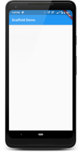
2. PreferredSizeWidget appBar: It is one of the important property in Scaffold class uses the AppBar widget. Which is a horizontal bar typically shown at the top of an app. AppBar widget having its own properties like actions, title, leading, and so on.
@override
Widget build(BuildContext context) {
  return Scaffold(
    appBar: AppBar(
      title: Text("Scaffold Demo"),
    ),
  );
}
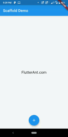
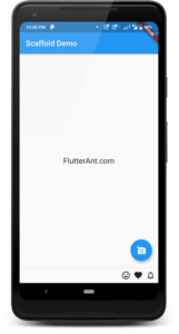
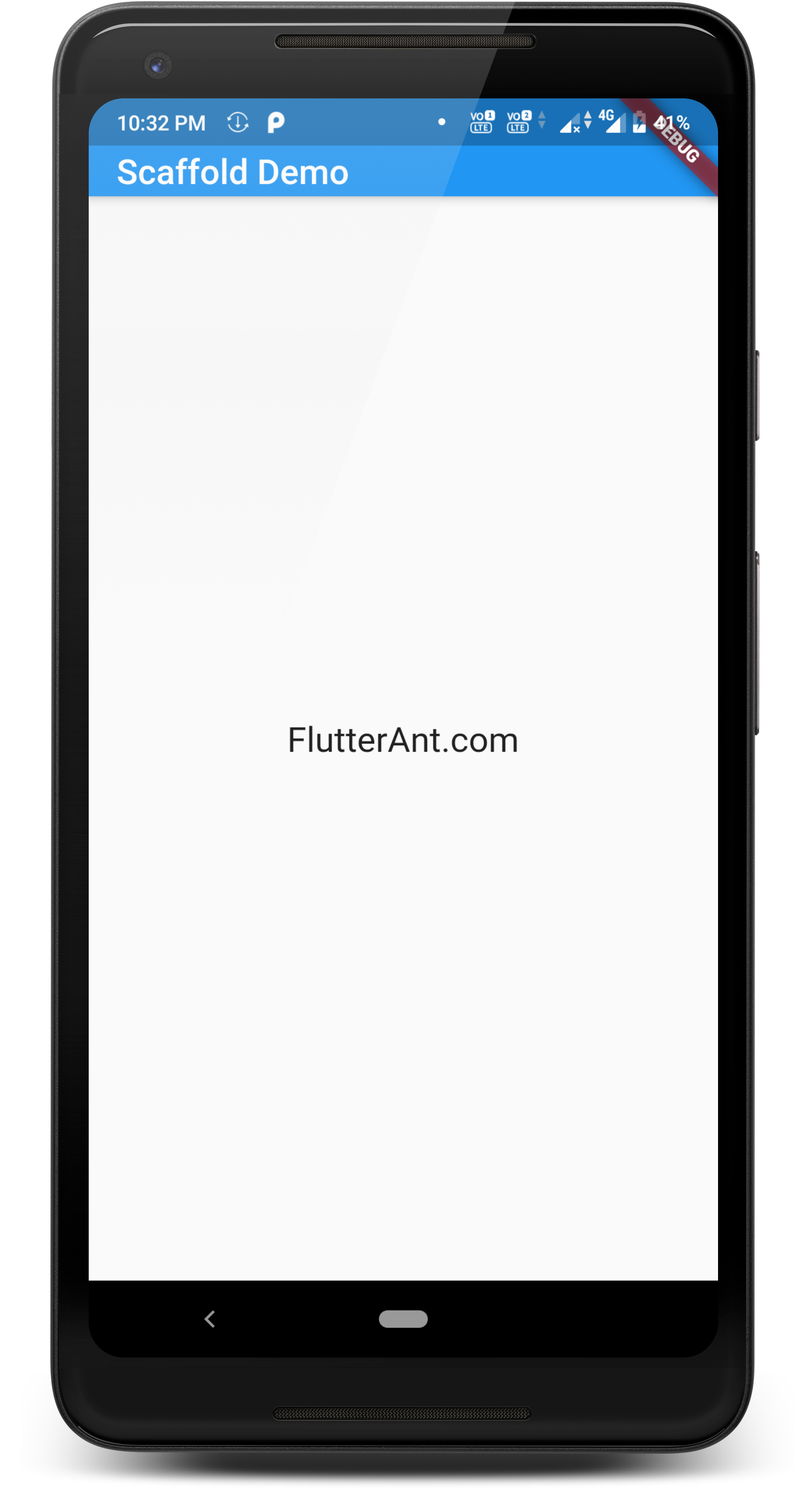
3. Widget body: The body is the primary content of the Scaffold. It is displayed below the appBar and behind floatingActionButton and drawer. By default widget in the body of the scaffold is positioned at the top left of the available space between the appBar and bottom of the scaffold. Here I’m adding Center widget to display the text in the center of the screen.
 @override
  Widget build(BuildContext context) {
    return Scaffold(
      appBar: AppBar(
        title: Text("Scaffold Demo"),
      ),
      body: Center(
          child: Text(
        "FlutterAnt.com",
        style: TextStyle(fontSize: 20.0),
      )),
    );
  }
4. Widget floatingActionButton: The FloatingActionButton is a Button with an icon that is placed at the bottom right corner of the screen by default and floating above on the body. The position of this button will be fixed even if we scroll the screen.
 @override
  Widget build(BuildContext context) {
    return Scaffold(
      appBar: AppBar(
        title: Text("Scaffold Demo"),
      ),
      body: Center(
          child: Text(
        "FlutterAnt.com",
        style: TextStyle(fontSize: 20.0),
      )),
      floatingActionButton: FloatingActionButton(
        onPressed: () {},
        child: Icon(Icons.add),
      ),
    );
  }
5. FloatingActionButtonLocation floatingActionButtonLocation: Using this property we can define a position for the floatingActionButton. The position constants are like centerDocked, centerFloat, endDocked, endFloat, endTop, miniStartTop and startTop.
floatingActionButtonLocation: FloatingActionButtonLocation.centerDocked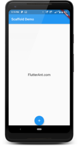
floatingActionButtonLocation: FloatingActionButtonLocation.centerFloat
floatingActionButtonLocation: FloatingActionButtonLocation.endDocked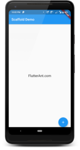
floatingActionButtonLocation: FloatingActionButtonLocation.endFloat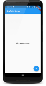
floatingActionButtonLocation: FloatingActionButtonLocation.startTop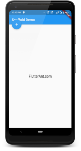
floatingActionButtonLocation: FloatingActionButtonLocation.miniStartTop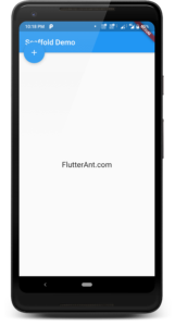
6. FloatingActionButtonAnimator floatingActionButtonAnimator: This property provides the animations to move the FloatingActionButton between FloatinActionButtonLocations.
FloatingActionButtonAnimator.scaling is the default animator.
7. List<Widget> persistentFooterButtons: Using this we can add a set of buttons that are displayed at the bottom of the scaffold. Even if the body of the scaffold scrolls, these buttons remain visible. PersistentFooterButtons are displayed below the scaffold body and above the Bottom navigation bar.
@override
  Widget build(BuildContext context) {
    return Scaffold(
      appBar: AppBar(
        title: Text("Scaffold Demo"),
      ),
      body: Center(
        child: Text(
          "FlutterAnt.com",
          style: TextStyle(fontSize: 20),
        ),
      ),
      floatingActionButton: FloatingActionButton(
        onPressed: () {},
        child: Icon(Icons.add_a_photo),
      ),
      //Here i'm adding few icons as buttons
      persistentFooterButtons: <Widget>[
        Icon(Icons.tag_faces),
        Icon(Icons.favorite),
        Icon(Icons.notifications_none),
      ],
    );
  }
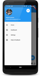
8. Widget drawer: A drawer is a slider menu that is placed on the side of the scaffold body. A user can swipe in from either left-to-right or right-to-left. It uses Drawer widget properties. Here the elevation must be non-negative.
drawer: Drawer(
        child: Column(
          children: <Widget>[
            UserAccountsDrawerHeader(
              currentAccountPicture: CircleAvatar(
                backgroundColor: Colors.transparent,
                radius: 30.0,
                backgroundImage: NetworkImage(
                    "https://www.flutterant.com/wp-content/uploads/2020/07/satyam.jpg"),
              ),
              accountEmail: Text("sa**********@***il.com"),
              accountName: Text("Satyam parasa"),
              otherAccountsPictures: <Widget>[
                CircleAvatar(
                  backgroundColor: Colors.white,
                  child: Text("SP"),
                ),
              ],
            ),
            ListTile(
              title: new Text("Home"),
              leading: new Icon(Icons.home),
            ),
            ListTile(
              title: new Text("Dashboard"),
              leading: new Icon(Icons.dashboard),
            ),
            ListTile(
              title: new Text("Settings"),
              leading: new Icon(Icons.settings),
            ),
            ListTile(
              title: new Text("Help & Feedback"),
              leading: new Icon(Icons.help),
            ),
          ],
        ),
      ),
9. Widget endDrawer: A endDrawer property is the same as the drawer. It is also uses Drawer widget properties. In the endDrawer by default, the drawer is displayed on the right side of the screen.
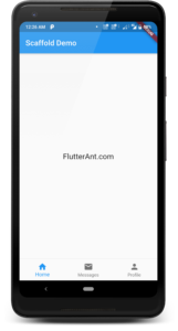
10. Widget bottomNavigationBar: It’s used to show the app navigation bar at the scaffold’s bottom. The bottom navigation bar has a number of elements ranging from 3 to 5. Text labels, icons, or both are used to represent these elements. It allows users to quickly navigate between an app’s top-level views. For larger screens, it is not advised; side navigation may be a better match.
bottomNavigationBar: BottomNavigationBar(
        currentIndex: 0,
        items: [
          BottomNavigationBarItem(
            icon: Icon(Icons.home),
            title: Text('Home'),
          ),
          BottomNavigationBarItem(
            title: Text('Messages'),
            icon: Icon(Icons.mail),
          ),
          BottomNavigationBarItem(
              icon: Icon(Icons.person), title: Text('Profile'))
        ],
      ),
11. Widget bottomSheet: It is used to display the persistent bottom sheet. A persistent bottom sheet remains visible even user interacts with other parts of the screen. We can give any widget for this bottom sheet property but we can’t get the actual properties of BottomSheet, which is used by the implementation of showBottomSheet and showModalBottomSheet.
 bottomSheet: Container(
        color: Colors.yellow,
        height: 50,
        child: Center(
            child: Text(
          "Welcome to the flutterAnt.com",
          style: TextStyle(color: Colors.red),
        )),
      ),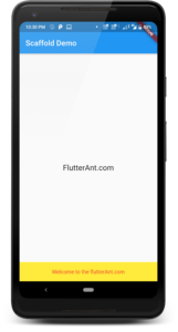
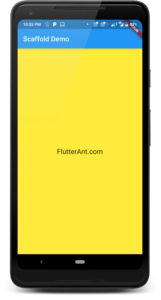
12. Color backgroundColor: This property sets the background color of the whole scaffold.
 @override
  Widget build(BuildContext context) {
    return Scaffold(
      appBar: AppBar(
        title: Text("Scaffold Demo"),
      ),
      body: Center(
        child: Text(
          "FlutterAnt.com",
          style: TextStyle(fontSize: 20),
        ),
      ),
      backgroundColor: Colors.yellow,
    );
  }
13. bool resizeToAvoidBottomPadding: This property is deprecated, We need to use resizeToAvoidBottomInset instead.
14. bool resizeToAvoidBottomInset: If the value is true, the body and scaffold’s widgets can be resized automatically to avoid keyboard overlapping. We can get a clear idea by seeing the following output screens.


15. bool primary: This property is used to define whether the scaffold is being display at top of the screen or not. The default value is true.


16. DragStartBehavior drawerDragStartBehavior: This property determines the way that drag start behavior is handled. If we use DragStartBehavior.start the opening and closing a drawer will begin upon the detection of a drag gesture and it will make drag animation smoother. If we use DragStartBehavior.end will begin when a down event is first detected and it will make drag behavior feel slightly more reactive. The default behavior is DragStartBehavior.start.
17. bool extendBody: If we set true, the body will be extended to the bottom of the scaffold instead of only extending to the top of the bottomNavigationBar or the persistentFooterButtons. If we see the below right side output screen the scaffold body is visible through the bottom navigation bar’s notch. The default value is false.


18. bool extendBodyBehindAppBar: If we set true, then the height of the body is extended to include the height of the app bar and the top of the body is aligned with the top of the app bar. This is useful if the app bar’s AppBar.backgroundColor is not completely opaque. The default value is false.


19. Color drawerScrimColor: It will be used to give color to the primary content while the drawer is open.
 @override
  Widget build(BuildContext context) {
    return Scaffold(
      appBar: AppBar(....),
      drawerScrimColor: Colors.yellow,
      body: child: Center(...),
      drawer: Drawer(...)
      ),
    );
  }
20. double drawerEdgeDragWidth: The width of the area within which a horizontal swipe will open the drawer.
21. bool drawerEnableOpenDragGesture: If the value is false, the drawer can’t be opened by a drag gesture. The default value is true (drag gesture is enabled).
22. bool endDrawerEnableOpenDragGesture: If the value is false, the end drawer can’t be opened by a drag gesture. The default value is true (drag gesture is enabled).
That’s all about the Flutter Scaffold widget
For more info about the Scaffold widget
Thanks for reading … 🙂

It’s informative and easy in words. Thanks Bro 👍.
Thanks man 😊
I see something really interesting about your web site so I saved to my bookmarks.
Thanks a lot for your effort, I will bookmark this page to read It again when I need
Greate post. Keep writing such kind of information on your site.
Im really impressed by your site.
Hi there, You have done a fantastic job. I’ll definitely digg it and personally recommend to my friends.
I’m confident they’ll be benefited from this site.
Good way of describing, and nice piece of writing to take facts
about my presentation topic, which i am going to present in institution of
higher education.
Very energetic post, I loved that a lot. Will there be a part 2?
Having read this I thought it was really enlightening. I appreciate you finding the time and effort to put this article together.
I once again find myself spending a significant amount of time
both reading and commenting. But so what, it was still
worthwhile!
Awesome article post.Really looking forward to read more. Awesome.
Your article helped me a lot, is there any more related content? Thanks!